 Logo #2
 Logo #3


Atomic Chef Harvey


Posted 16 June 2009 - 04:00 AM
Logo #2Logo #3
Advanced Member

Posted 16 June 2009 - 05:01 AM
Gold Star Recipient

Posted 16 June 2009 - 05:20 AM
Frequent Member

Posted 16 June 2009 - 06:01 AM
Advanced Member

Posted 16 June 2009 - 07:09 AM
Puller of Meats
Posted 16 June 2009 - 07:10 AM
Comptroller of Some Stuff

Posted 16 June 2009 - 07:30 AM
Advanced Member

Posted 16 June 2009 - 08:43 AM
Advanced Member

Posted 16 June 2009 - 08:51 AM
Comproller of Toilet Tank Vodka

Posted 16 June 2009 - 10:17 AM
Skynet Architect

Posted 16 June 2009 - 01:13 PM
I'm having trouble seeing the connection between the anvil and boilermaking but the split doesn't bother me. I like 2 the best.Number three for me.I've never liked nor understood the split in the anvil graphic of the other two, though I've seen it many, many times.
Advanced Member
Posted 16 June 2009 - 01:34 PM
I also didn't see the connection. I've worked extensively with boilermakers in the construction of power boilers, and I never saw an anvil in their gang box. I guess that the connection is an image of craftsmanship?I'm having trouble seeing the connection between the anvil and boilermaking but the split doesn't bother me. I like 2 the best.
Comptroller of Forum Content
Posted 16 June 2009 - 02:19 PM
Advanced Member

Posted 16 June 2009 - 03:24 PM
Advanced Member

Posted 16 June 2009 - 06:40 PM
Atomic Chef Runner-Up

Posted 16 June 2009 - 08:58 PM
+1 voted for #3I vote for Three. I like two and three, but 2 seems like a lable that would go on the neck of a bottle. All very cool!
Atomic Chef Runner-Up
Posted 16 June 2009 - 08:59 PM
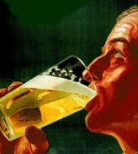
good beer and good food.#1 reminds me of-
Puller of Meats
Posted 16 June 2009 - 09:59 PM
Cheap Blue Meanie

Posted 16 June 2009 - 10:02 PM
yep I agreeI'm having trouble seeing the connection between the anvil and boilermaking but the split doesn't bother me. I like 2 the best.
Advanced Member
Posted 17 June 2009 - 04:13 AM
Getting washed out is a valid concern, but I think it could also work as an advantage; use the lighter color of the label to create a border which will delineate the label, but the color of the label may visually connect with the rest of the bottle giving it unity. It may look like one "thing" instead of a bottle with a label (which is perfectly fine also...just an observation).I'm with you on #3. You could walk down any grocery isle and see similar 2 color logos on many different products...it made me think of bread or borax. I kind of like it though...it reminds me of products I saw growing up in the 70's. It's also the most dynamic...it has energy saying "Hey...look at me!" reminds me of the "BLAM" and "POW" of the original Batman series.Since some have commented on the importance of the anvil, maybe you could create a sentence or two to describe and identify your beer (brand). This would also give you more content to fill space on the label if you wanted to make #1 or #2 a bit bigger like #3.As they are I think #1 will pop the most on a brown glass bottle. I like #2 but I think it will get washed out a bit on brown glass. #3 looks to me too much like something on a box of flour or baking soda.
0 members, 0 guests, 0 anonymous users

Community Forum Software by IP.Board
Licensed to: Brews-Bros.com
